Binding a CSS Rule
August 29, 2018
This article presents a TornadoFX app that associates data with a CSS rule. When a selection changes, so does the CSS rule. Although this can be achieved with listeners, data binding is preferred since bound properties are available to other areas of the program. Additionally, since so much of TornadoFX relies on bound properties, this code style is more consistent.
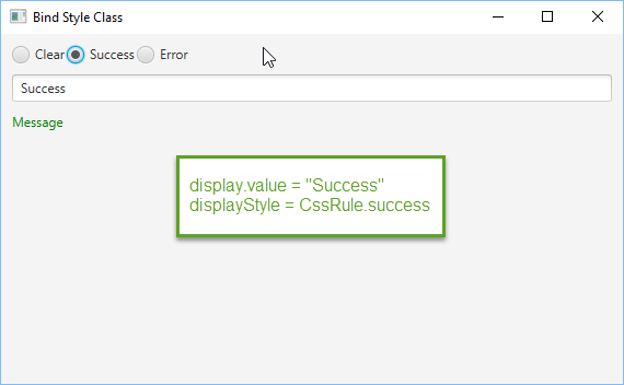
This short video shows the app in operation. There are three RadioButtons across the top. Selecting a RadioButton updates both a TextField and the style applied to a Label. Selecting the Success RadioButton puts a "Success" in the TextField and turns the Label message Green.
The app uses two bound properties to track the selected state in a control-neutral way. display is a SimpleStringProperty factored out of the root control declaration. displayStyle is a SimpleObjectProperty derived from a Kotlin when statement. displayStyle will recompute itself anytime its Observable (the display SimpleStringProperty) changes.

Stylesheet
The Stylesheet for the app contains three CssRules: clear, success, and error. These rules will determine the -fx-text-fill applied to the message Label.
class BSCStyles : Stylesheet() {

    companion object {
        val clear by cssclass()
        val success by cssclass()
        val error by cssclass()
    }

    init {

        clear {
            textFill = Color.BLACK
        }

        success {
            textFill = Color.GREEN
        }

        error {
            textFill = Color.RED
        }
    }
}
View
The View begins with three fields: display, displayStyle, and tg. tg is used to group the RadioButtons. display is a SimpleStringProperty() and will be bound to the selected RadioButton. displayStyle is a SimpleObjectProperty<CssRule> that will be reevaluated with changes to display.
class BindStyleClassView : View("Bind Style Class") {

    var tg : ToggleGroup by singleAssign()

    val display = SimpleStringProperty()

    val displayStyle = Bindings.createObjectBinding(
            Callable {
                when(display.value) {
                    "Success" -> BSCStyles.success
                    "Error" -> BSCStyles.error
                    else -> BSCStyles.clear
                }
            },
            display
    )
In the root declaration, tg has its selected value bound to display. RadioButtons are added to an HBox and the first one, "Clear", is selected. This provides the initial state for display. The TextField is also bound to display and highlights the sharing of bound properties mentioned at the start of the article. Finally, the bindClass function is used on the message Label to link the Label's style class to the displayStyle property.
Behind-the-scenes, bindClass() adds a ChangeListener which will manually add the CSS style class. TornadoFX wraps the handling of the ChangeListener including its removal in bind function that meshes with those provided by JavaFX.
    override val root = vbox{

        tg = togglegroup {
            bind( display )  // bind to selected toggle
        }

        hbox {
            radiobutton("Clear", tg) {
                isSelected = true
            }
            radiobutton("Success", tg)
            radiobutton("Error", tg)
            spacing = 2.0
        }

        textfield(display)
        label("Message") {
            bindClass(displayStyle)
        }

        padding = Insets(10.0)
        spacing = 10.0
    }
}
While listeners are a familiar way to update an item in response to a change, binding is preferred. Binding factors out properties and makes them available to the larger program. The JavaFX class Bindings has adapters that help when working with different types.
The complete BindStyleClass.kt file can be downloaded here.

By Carl Walker
President and Principal Consultant of Bekwam, Inc