Data Driven Row and Cell Styling with TornadoFX
October 24, 2018
To style a TableRow or a TableCell in TornadoFX based on a record's contents, use the cellFormat function. This function registers a TableCell factory which gives access to the TableRow. When returning a TableCell object, set a CSS style class for the object and also set a class for the parent TableRow. Remember to reset the classes as the TableCell can be recycled.
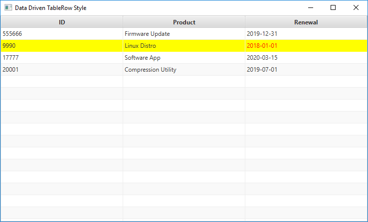
This screenshot shows a TableView displaying a Subscription record. If the Renewal date is later than today, a red text style is applied to the TableCell. For additional emphasis, the entire TableRow meeting this condition is displayed with a bright yellow background.

TableRow and TableCell Styled Based on Data
The program starts with an FX-enabled domain object "Subscription". The third property "renewalDateProperty" is a SimpleObjectProperty containing a LocalDate.
class Subscription(id : Int, productName : String, renewalDate : LocalDate) {
    val idProperty = SimpleIntegerProperty(id)
    val productNameProperty = SimpleStringProperty(productName)
    val renewalDateProperty = SimpleObjectProperty(renewalDate)
}
The app uses a single TornadoFX View. A the start of the View, a variable containing the data (called "data") for the TableView is declared.
class DataDrivenTableRowStyleView : View("Data Driven TableRow Style") {

    val data = listOf(
            Subscription( 555666, "Firmware Update", LocalDate.of(2019, Month.DECEMBER, 31) ),
            Subscription(9990, "Linux Distro", LocalDate.of(2018, Month.JANUARY, 1) ),
            Subscription( 17777, "Software App", LocalDate.of(2020, Month.MARCH, 15) ),
            Subscription( 20001, "Compression Utility", LocalDate.of(2019, Month.JULY, 1) )
    ).observable()
The class continues with the View root definition. This is a single UI component, the TableView. The TableView contains three TableColumns. The first two simply map the idProperty and productNameProperty fields. The renewalDateProperty definition includes a cellFormat.
override val root = tableview(data) {

        column("ID", Subscription::idProperty)
        column("Product", Subscription::productNameProperty)
	    column("Renewal", Subscription::renewalDateProperty) {
            cellFormat {
                text = it.toString()
                if( it.isBefore(LocalDate.now())) {
                    addClass(DDTRS_Styles.overdue)
                    if( this.tableRow != null ) {
                        this.tableRow.addClass(DDTRS_Styles.highlighted)
                    }
                } else {
                    removeClass(DDTRS_Styles.overdue)
                    if( this.tableRow != null ) {
                        this.tableRow.removeClass(DDTRS_Styles.highlighted)
                    }
                }
            }
        }

        columnResizePolicy = CONSTRAINED_RESIZE_POLICY

        prefWidth = 736.0
        prefHeight = 414.0
    }
}
If you don't need to consider the contents of the record, visit this post for styling without calling cellFormat. For example, if you want to alternate color based on odd and even row numbers, you can do this all through the Stylesheet.
Inside the cellFormat, the text field of the TableCell is set to the contents of the LocalDate converted to a String. Next, a check against the current date is performed. If the condition is met -- the renewal has lapsed -- a style called "overdue" is applied on the TableCell. The parent TableRow also gets a style "highlighted".
For performance reasons, TableCells are recycled. This means that you will need to clear any previously-set objects of their highlighted and overdue styles. Otherwise, you may find errant highlighting for rows that don't meet the required condition.
This is the Stylesheet subclass for the TableRow (tableRowCell + highlighted) and the TableCell which gets an explicit style for the Labeled "overdue".
class DDTRS_Styles : Stylesheet() {

    companion object {
        val overdue by cssclass()
        val highlighted by cssclass()
    }

    init {
        tableView {
            tableRowCell {
                and( highlighted ) {
                    backgroundColor += c("yellow")
                }
            }
        }

        overdue {
            textFill = c("red")
            fill = c("blue")
        }
    }
}
The trivial App and main are listed below.
class DataDrivenTableRowStyleDemo : App(DataDrivenTableRowStyleView::class, DDTRS_Styles::class)

fun main(args: Array<String>) {
    launch<DataDrivenTableRowStyleDemo>(args)
}
cellFormat provides a convenient way to customize the display of TableCells. In this example, cellFormat was not needed for the idProperty and productNameProperty fields so the simple column definition was sufficient. cellFormat can consider the overall record in determining how a cell should look. If the cell content isn't radically different -- say using a special editor or graphical UI control -- you can use the add/removeClass to apply a Type Safe CSS Style.

By Carl Walker
President and Principal Consultant of Bekwam, Inc